Custom field components
A custom component can be passed and rendered by setting the ui.component property on a field. This component completely overrides the original component, providing the user with the ability to fully customize the field.
Providing your own component
A field's ui.component property is a React component that accepts three props:
field: The field definition for the current field.input: The data and callbacks necessary to make an input.meta: Metadata about the field in the form. (e.g.dirty,valid)
Checkout the react-final-form docs for a more detailed description of the input and meta props.
Custom Component Example
Here is a custom slider component that can be used for adjusting image saturation.
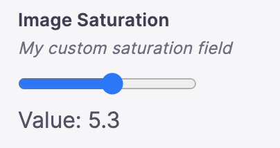
import { defineConfig, wrapFieldsWithMeta } from 'tinacms'//.. other fields{label: "Image Saturation",name: "saturation",type: "number",description: "My custom saturation field",ui: {parse: (val) => Number(val),// wrapping our component in wrapFieldsWithMeta renders our label & description.component: wrapFieldsWithMeta(({ field, input, meta }) => {return (<div><inputname="saturation"id="saturation"type="range"min="0"max="10"step=".1"// This will pass along props.input.onChange to set our form values as this input changes.{...input}/><br />Value: {input.value}</div>)})}}
Note: in this example,parseis also needed. Read more aboutparse.
Using pre-built components
Tina also provides a variety of pre-built components. To specify these, the ui.component property should be configured with the string name of the registered field plugin.
Below is a list of default fields.
Default Field Plugins
Tina also supports some add-on field plugins. These need to be imported and registered from separate packages:
Configuring a field plugin
Each field has a unique set of properties that can be configured within the schema.
For example, if you take a look at the color field plugin's definition, it takes a colorFormat property. We can configure that in our schema like so:
// ...{type: 'string',label: 'Background Color',name: 'color',ui: {component: "color",colorFormat: "rgb"}},// ...
Video Tutorial
For those who prefer to learn from video, you can check out a snippet on "Customizing Components" from our "TinaCMS Deep Dive" series.
Comparisons
© TinaCMS 2019–2024